Category: Process

  • Thank you, NUS Press

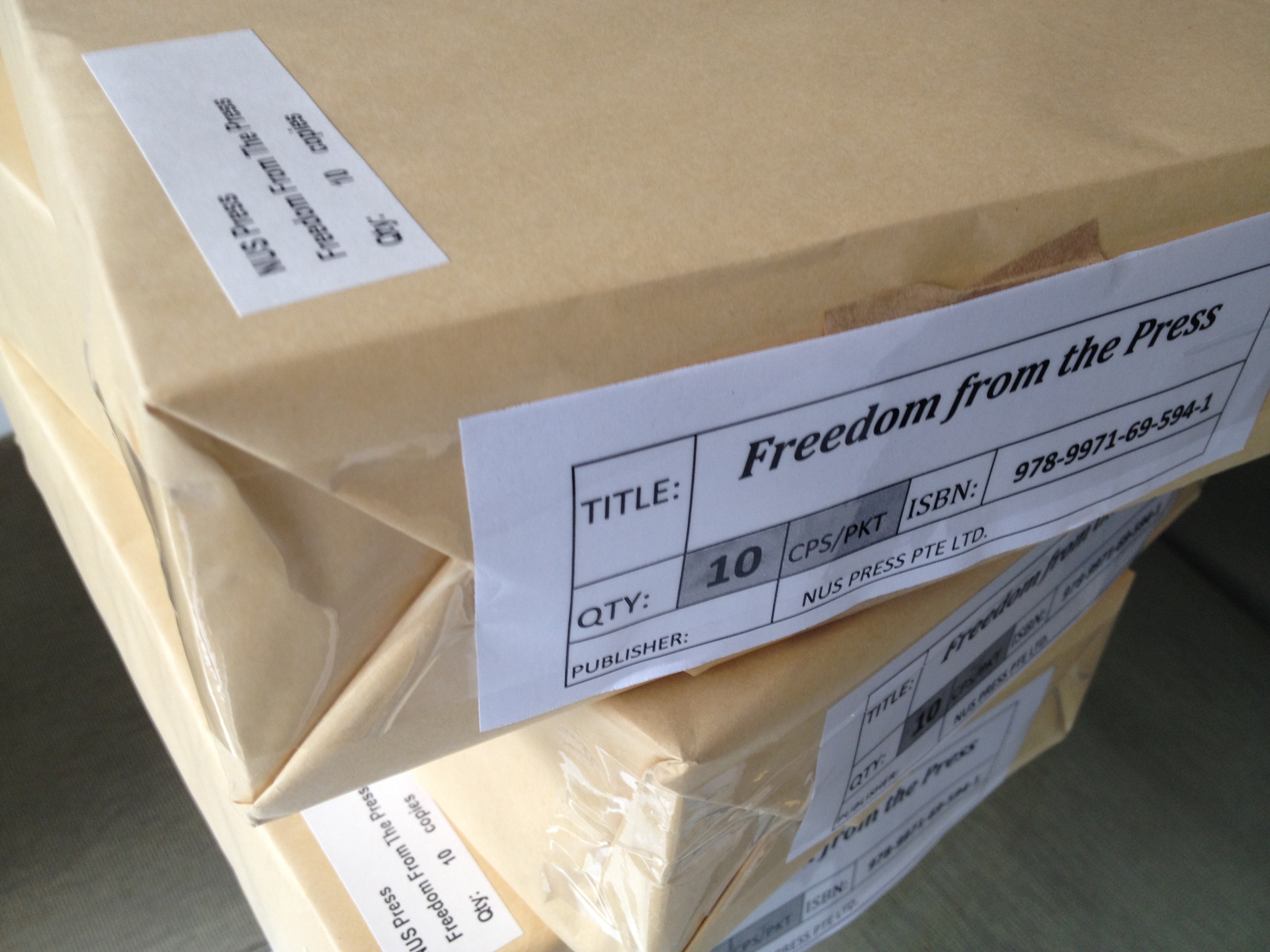
    Fresh from the printer.

    In April 2009, I met NUS Press managing director Paul Kratoska to ask if he would be interested in publishing a book on the Singapore press system. He said yes (subject to the usual review processes) and I set to work. I thought it would take a year, but life got in the way, so it took three.

    At last, it is done. On Thursday, I visited Paul’s office to pick up my copies. I’m told Freedom From The Press should be in Singapore bookstores by next weekend, retailing at S$38.

    My previous book, Contentious Journalism and the Internet, had also been published by NUS Press, when it was run by Peter Schoppert. Originally called Singapore University Press, NUS Press has a long tradition of academic publishing. But one of the unfortunate side-effects of Singapore universities’ drive for so-called “world class” excellence (the most serious being the devaluation of Singapore studies across the social sciences here) is that many scholars now think that they should target foreign imprints instead of settling for Singapore’s top academic publisher.

    Recently, one of my senior colleagues said as much, suggesting that my CV would look better if my book was published by an entity more illustrious than NUS Press.

    I knew of this foreign bias within Singapore universities long before I met up with Paul three years ago. Nonetheless, NUS Press was my first stop, and thankfully it was my last. After all, I didn’t write this for my CV. It is a book by a Singaporean writer for a probable readership that is mainly in Singapore, so it made sense to publish it locally. Assuming people buy it, it would be easier for bookstores to replenish their shelves. And it would be more accessible than some excellent academic books on Singapore published in the US and Europe that come with astronomical price tags.

    Furthermore, I try to chart my young academic career by the light of living role models, rather than clinical appraisal forms and bureaucratically-derived KPIs. And many of the scholars I most respect – including Wang Gung Wu, Anthony Reid, Chan Heng Chee,  Eddie Kuo, Chua Beng Huat, Kwok Kian Woon, Hong Lysa and Huang Jianli – have titles under the SUP or NUS Press imprint. If it was good enough them, it is certainly good enough for me.

    So, thanks NUS Press, for helping me get this book out.
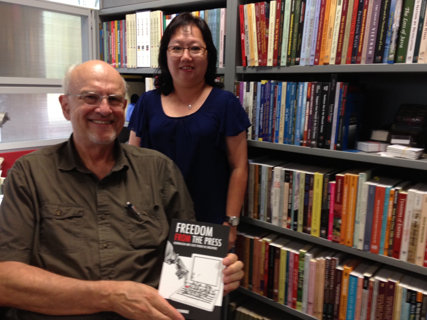
    Paul Kratoska and Lena Qua of NUS Press.
  • The cover story, continued

    It started with a gimmicky Facebook appeal: which cover design did my Facebook friends prefer? They voted and there was a clear favourite:

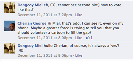
    But there was also a strong suggestion that the photo I’d picked for the cover – something from my own collection – was clichéd. The design purists suggested an all-typographical cover. But, those with book-selling experience cautioned that books with pictures on the cover tend to attract more attention. The reply that really caught my attention, though, was one from my artist buddy at the Straits Times, Dengcoy Miel. For some reason he couldn’t see the shortlisted cover design on his computer. I saw my opportunity…

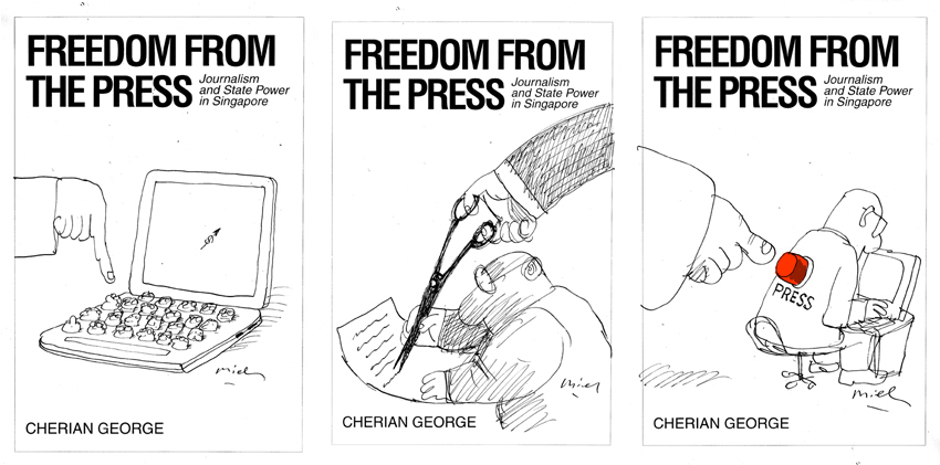
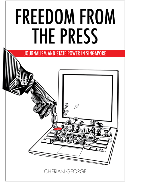
    Dengcoy and I have collaborated on various projects inside and outside the Straits Times. I wrote the text for his little book of Singatoons, for example. For me, at least, it was a thrill to work together again (although “work” is probably the wrong verb; it usually feels like play). I gave him a quick synopsis and before long he offered some sketches…

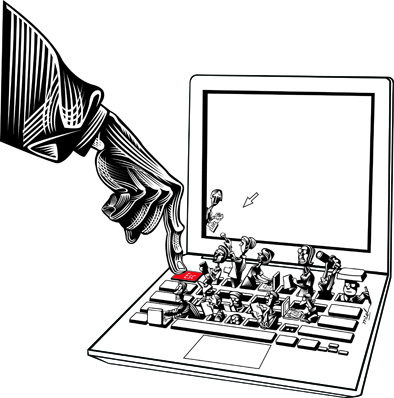
    To me, the first one was the most promising. I made a few minor suggestions: “Would it be possible to have the finger reaching for the ESC key? I realise it may be hard to make the key visible. But the reason why this would be a good touch is that it would represent clearly the government’s power to ‘reboot’ the press any time it likes. If the heads represent the press, then can you make half of them women and most of them younger than us? Would it be possible to make it more obvious that they are reporters, by having a few of them hold out mics, a couple hold cameras? Let’s show them at work, rather than looking like robots, because a key point in my book is that journalists try to be professional even if the government has its finger on the ‘esc’ key.”

    My other suggestions: “For visual/dramatic interest, I wonder if you should also draw in one small frightened reporter peeking out from behind the screen on the left side, watching at the hand. The politician: most don’t wear suits so he could have a long sleeved white shirt if you like. But I guess suits symbolise power better that shirts do. So I leave that up to you.”

    And knowing that I wasn’t going to be able to pay him his worth (if at all) I suggested that he include a self-portrait – a cartoonist with a sketch pad amidst the other journalists.

    Since the time we were colleagues in Times House, Miel has gone up in the world. So his moonlighting on this project was interrupted by a trip to Paris to exhibit his works and give talks. Today, at last, his final masterpiece arrived:


    Here’s how it could look on the cover:

    That’s another step closer to publication. Thanks, Miel!

    UPDATE

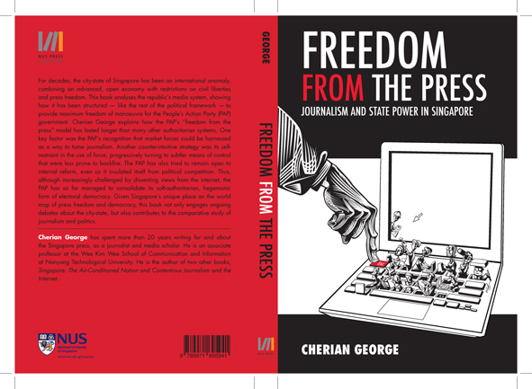
    Miel liked the idea of black bands on the cover: “It looks a lot more solid and stable,” he said. The designer at NUS Press gave it the final touch: a blood red back and spine. Here’s what’s going to press:


  • The news doesn’t wait, so more edits needed

    My poor publisher. I’ve had to make more changes to the text, which has already been typeset. This time, it’s because this week’s threatened libel suit against a prominent website meant I have to update the following paragraph on page 170. Changes in red, with some phrases deleted to keep the length unchanged:

    Thus, the internet has become a lively counter-hegemonic space, where contentious journalism challenges the status quo in a way not seen for decades. A government not known for its tolerance of opposition showed remarkable self-restraint in its reaction to online dissent — even in cases when the critics were fully within reach of the authorities. This was certainly not because it had become liberal in outlook. Defamation suits, prosecutions for contempt of court and other actions against offline expression continued to punctuate Singapore’s political calendar. In effect, the government operated a dual regulatory system for media, with stricter standards applied to print and broadcasting than to online media. The idea of differential censorship for mass media and niche media was not new: . In the pre-internet era, this principle was enshrined in the film classification system, which allowed films that would have to be censored for television broadcast to be screened uncut for adult audiences in cinemas. Similarly, books and plays were regulated less stringently than newspapers. In the early years of the web, the same logic might have applied to internet regulation: websites were niche media and did not require the same scrutiny as the national news media organisations. Quickly, though, some online media became mass media with tens of thousands of readers, as many as smaller newspapers such as the Business Times, Berita Harian or Tamil Murasu. In early 2012, government leaders threatened to sue Yawning Bread and TREmeritus (the new incarnation of Temasek Review) for libel, indicating its preparedness to act against prominent websites. However, wild anonymous attacks on the establishment continued unabated on various online forums and Facebook. The government appeared to reconcile itself to a new political terrain where it would no longer fully control what was said or shown publicly.

  • To the drawing board

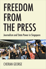
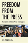
    I’m glad I reached out to my Facebook friends for feedback on my proposed covers. The original design was this:

    I was emotionally attached to the photo – mainly because I shot it myself. But I’m old enough to know that ego is not the best guide to making creative choices. So although my publisher was happy with the mock-up, I decided I’d better consult others.

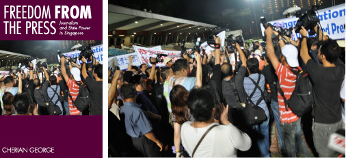
    I turned to my friend, Tay Kay Chin, who recently collaborated with me on the GE11 photo magazine project and whose design sensibilities I trust. He confirmed my fears, commenting that “the picture of media photographers has become a cliché to illustrate press-related issues”.

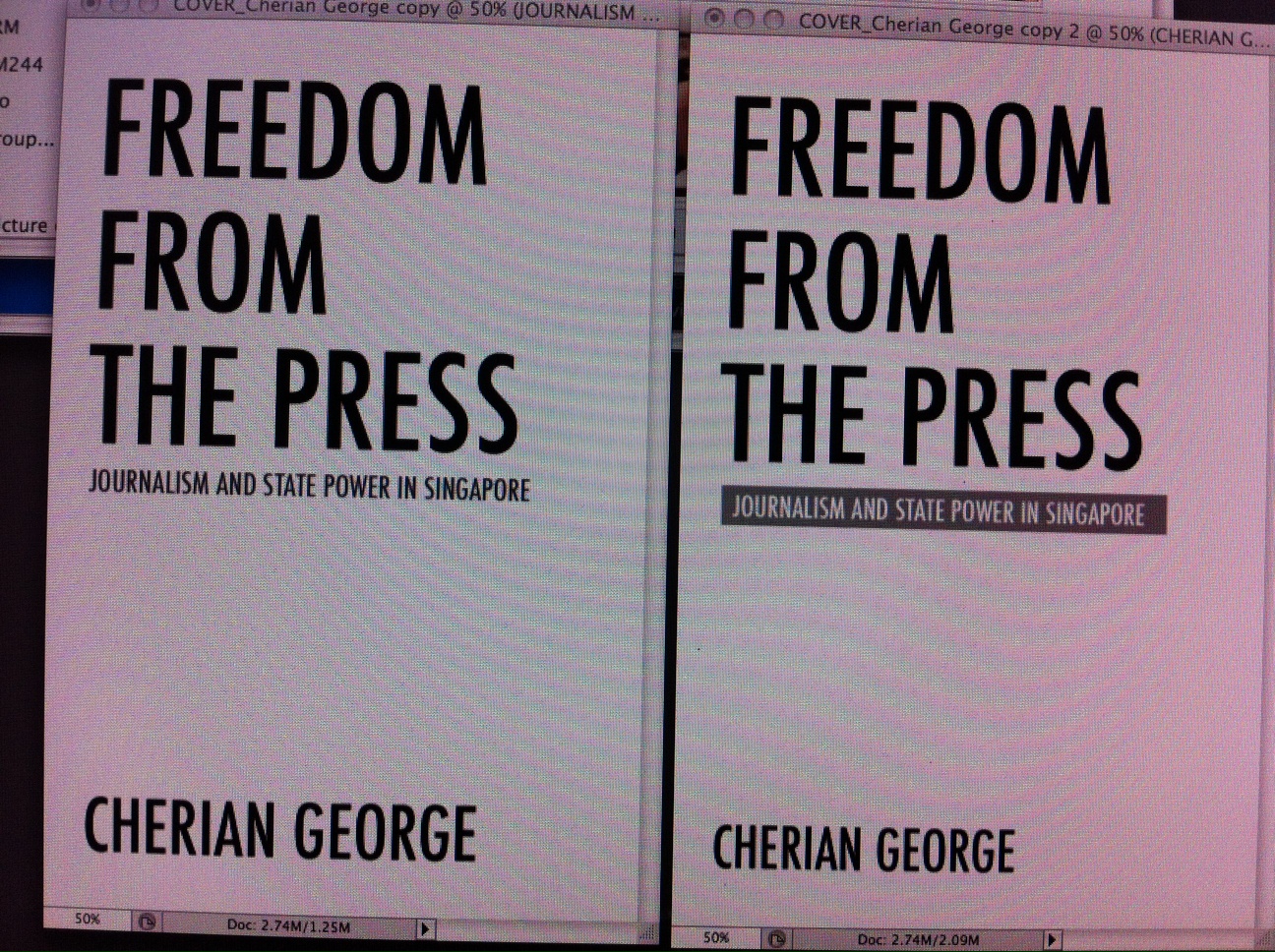
    He approved of my choice of Futura for the typeface, though (“tall and classy”, he said) and suggested a typography-only cover. The title was strong enough to sell the book, he said. Kay Chin quickly MMSed a photo of a couple of options (right).

    That’s when I decided to do a poll. In addition to my original design and Kay Chin’s typography-only cover, I did a hybrid version, with larger type and a smaller image.

     Option C (left) turned out to be the crowd favourite, garnering 44 percent of the 115 votes cast, including from cartoonist Otto Fong. Around 23 percent, including Ivan “Rambling Librarian” Chew, liked my original cover for the photo and strong colour. Around 27 percent went for Kay Chin’s type-only version.

    So, should I go with the popular vote and pick Option C? KC Chew, who ran his own publication design house before becoming Singapore’s most successful university fund-raiser, warned me not to be governed by a poll. The respondents are not expert cover designers nor marketeers, he pointed out. “Let the poll results guide you but you can still make a non-bandwagon choice regardless!” he said.

    One thing that the feedback forces me to admit is that my photo will have to go. “The title is great but the photo doesn’t quite do it justice,” said fellow academic Lim Sun Sun. The New Paper’s design chief (and the ST group’s Journalist of the Year 2010) Hup Lee didn’t like the covers with the photos either: “A and C is some thing I would expect to see if Tom, Dick and Harry were to write the same book. My take: B. It’s classy, clean with a tinge of seriousness. No photo needed.”

    But, would an all-typography cover be too austere? Well, one option is to add a graphic illustration. One of Singapore’s most respected newspaper artists has promised to send me some sketches. Watch this space!

  • Playing with the cover

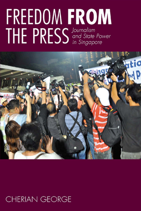
    Today, I went through my archive of pictures hoping to find an image that might work for the book cover. I settled on a series of photos that I shot at Toa Payoh Stadium around 4am on the morning after the Presidential Election. A scrum of photographers, cameramen, reporters and supporters was surrounding Tony Tan, who had just entered the stadium after having been declared the winner.

    The photo shows the media’s hunger for news. Beyond that, the image could mean different things to different people – which is why I like it. Does it show the media doing their job of scrutinising state power? Or perhaps it represents how they fall over one another to give establishment newsmakers publicity they don’t deserve? It could also symbolise the mob that PAP leaders are so suspicious of – the irrational interference that they believe governance should be insulated from.

    I did a quick mock-up and sent it to my publisher, who said they could work with it.